
Metropolitan Planning Council
Young and old enjoy the fun at Union Station's trainYARD
 By Marisa Novara and MPC Research Assistant Jason Brown
 - September 18, 2013
Last time on Placemaking Chicago:
In a train station not too far away, A colorful amoeba and a spot to play…
The last week of August brought a couple of exciting firsts to Chicago’s Union Station, as the winners of the Metropolitan Planning Council’s 2013 Placemaking Contest installed their projects and let the public go to work—or rather, play—on them!
Graham Grilli
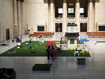
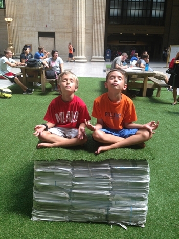
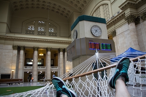
One installation was a creative revisioning of Union Station’s Great Hall by SPACE Architects and Planners. Anyone who has passed through Union Station—or watched The Untouchables—knows that the Great Hall is a beautiful, cavernous reminder of a romantic transit past. But is it only that? If there were more of a reason to stay and interact with the space, would it feel different? With SPACE’s trainYARD installation, we found out: It transformed the place completely, countering the desire to rush through the Great Hall on the way elsewhere, or to stare numbly at a phone while waiting for a train. trainYARD invited Amtrak and Metra passengers and anyone passing through to take a detour for play and relaxation. Activated with tetherball, hammocks, picnic tables and artificial turf, along with Chicago Tribune-donated newspapers that formed seating blocks, trainYARD successfully seeded a lush, temporary park in the middle of a booming downtown.
Metropolitan Planning Council
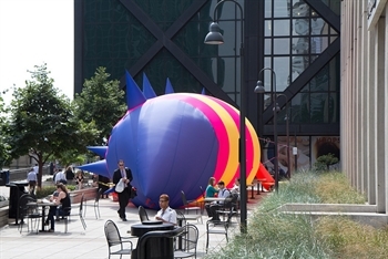
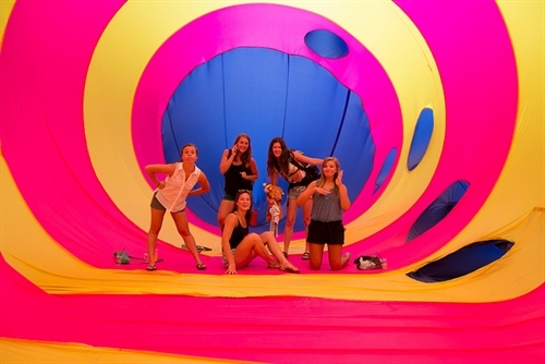
Latent Design’s Katherine Darnstadt and her teammates from the Kent State Cleveland Urban Design Collaborative brought to the Plaza of Fifth Third Center one of Chicago’s most brightly colored installations yet—the Blah Blah Blob. Many passersby wondered, “Is it a creature? Is it art? Is it a workout studio?” Those who stepped inside got to wander through the possibilities and decide for themselves. Blah Blah Blob was a unique installation not only because of its eye-catching shape, stripes and spikes (as one explorer reported, “We saw this from all the way up in our office and had to come check it out!”), but it also interrupted a well-traveled walkway and encouraged commuters to step outside of their workday routines. Darnstadt, the lead designer of the project, describes the Blob as an “inflatable public space.” With a room-sized belly held aloft by a mere fan or two, this light and simple installation invited us to question how we approach creative use and re-use of our public spaces.
Metropolitan Planning Council
Why the focus on Union Station? Many participants in Activate Union Station had this question, as well as, “So, this blob is going to be here all the time?” or “Why can’t there always be a park in here?” The installations were temporary, but the goal of the event was to catalyze our creativity and expand our collective vision of what Chicago Union Station can be.
As the contest’s organizers, we heard several questions about the contest repeatedly. We’ll summarize a few here:
Q: Why can’t it just be a train station? Why does it have to be more?
A: Why shouldn’t it be more? Chicago Union Station is not an airport, which is necessarily removed from day to day life due to runway space and noise. This station is smackdab in a bustling downtown, and as such can and should serve more than just rail passengers. Chicago’s downtown residential population grew 36 percent over the past ten years—that’s 48,288 more people looking for places to eat, shop and gather. The station, with its iconic architecture and available space, is poised to deliver.
Q: By making these spaces more attractive, won’t you just draw more homeless people?
A: Activating a space attracts more people, period. If only one group of people uses a space, it can be intimidating to those not in that group. When you intentionally create programming that attracts a range of people, then everyone can feel comfortable in that space.
Q: The station’s passenger concourse needs attention first. Why focus on anything else?
A: Plans to improve passenger flow and track capacity are underway (see the Union Station Master Plan). That said, start. Don’t wait until a site’s conditions are perfect to program it.
Q: Ten days? That’s it?
A: A key Placemaking principle is that you are never finished; so start small. Experiment. Observe. Tweak. Wash, rinse, repeat. Activate Union Station was a ten-day experiment from which we and Amtrak learned tremendously, and the lessons from which will be applied to any future programming. Plus, a short time frame and small budget reinforced our emphasis on simplicity: The point was not to create architecturally staggering installations. The beauty of trainYARD, for instance, was its simplicity and ease of access—no one needs an orientation to toss a beach ball in the air or lie on a hammock.
Metropolitan Planning Council
Activate Union Station helped us to answer the question, How can we use Union Station differently? Transportation hubs—stations where trains, buses, bikes, and taxis converge—around the country and around the globe are asking a similar question, and some are already have some very creative answers, such as Philadelphia’s The Porch. Here in Chicago, just after this contest wrapped, the station hosted a nationwide concert series, Station to Station, right in the Great Hall. As Chicago seeks to bolster its reputation as a global city, activating its key assets will be a big part of the equation. The 2013 Activate Union Station contest confirmed that Chicago Union Station is an ideal platform.
Metropolitan Planning Council